Project Background
Paxology is an educational experience that fosters a culture of nonviolence through the study of peace heroes from around the world. The Peace Heroes platform will enable students to study collaboratively across national boundaries.
Peace Heroes in already piloting in six schools in Israel, Palestine, Kenya, and South Africa in an offline format.
My contribution: secondary research, comparative analysis, sitemap, user flows, wireframes, visual design, user testing
Tools used: Adobe Photoshop, Sketch, Adobe Illustrator, pen and paper
The old website
The Paxology website was set up as a blog some time ago. There were a lot of interesting articles, but it was rather difficult to find out what it was about.
The new website
The goals of the new website are to communicate what Paxology does and why it is important, develop a clear navigation throughout the site and inspire emotional connection.
To reduce confusion, it was decided to focus on the name “Peace Heroes”.
Peace Heroes target audience:
Donors: People interested in supporting Paxology, who want to find out more about the organization, what is does and what its impact is.
Teachers and educators interested in teaching about peace heroes. They need information about and access to the curriculum.
Parents advocating for their school to include the Peace Heroes lessons into their curriculum.
The website will be build in 3 stages. The focus of stage 1 is to inform users about the organization, generate interest for the curriculum and encourage donations.
RESEARCH
To give our team a better understanding of the space our product will be in and what the opportunities are to make improvements to the user’s experience, I researched comparable websites.
Comparative Analysis
I looked at what other sites our audience may be using, sites focused on peace and sites that have an online curriculum.
Findings
Best Practices:
Familiar layout with large hero image, horizontal navigation
Prominent link to “Donate”Identify purpose on landing page
“Learn More” Call-to-action
Easy to identify “Download sample”
Easy to find resources
Links to social media
Common Practices:
Metrics on landing page
Sign in to download full lesson
Filter lessons by grade and subject
Opportunities:
Inspire emotional connection to the purpose on the landing page and feature pages (through imagery and supporting design)
Identify purpose on landing page
Easy to identify primary links to curriculum and “Donate”
Develop clear navigation throughout the site
High-level navigation bold and/or colorful
Sketches
Some ideas for the curriculum landing page (how users would choose a lesson), and how to structure the content of the lesson. I also sketched a quick user flow for a potential donor to help visualize the process.
Curriculum landing page and lesson
User flow for donors
Ideas on how to structure lessons and icons
Icons for different student activities
Sitemap
To show how to simplify the navigation and consolidate content I created a sitemap of the current site and one for the proposed new site.
The client decided against the upkeep of the blog for phase 1 and focus on curriculum.
User Flows
To show how a user would navigate from the homepage to a lesson, I created user flows for desktop and mobile.
Wireframes
After getting approval of the user flows, I created wireframes.
Homepage option 1
Homepage option 2
Landing page
Curriculum landing page
Curriculum activities page
Visual Design
Homepage
Based on the style guide provided by MoyoMedia, I explored some design options for the homepage.
Iterations
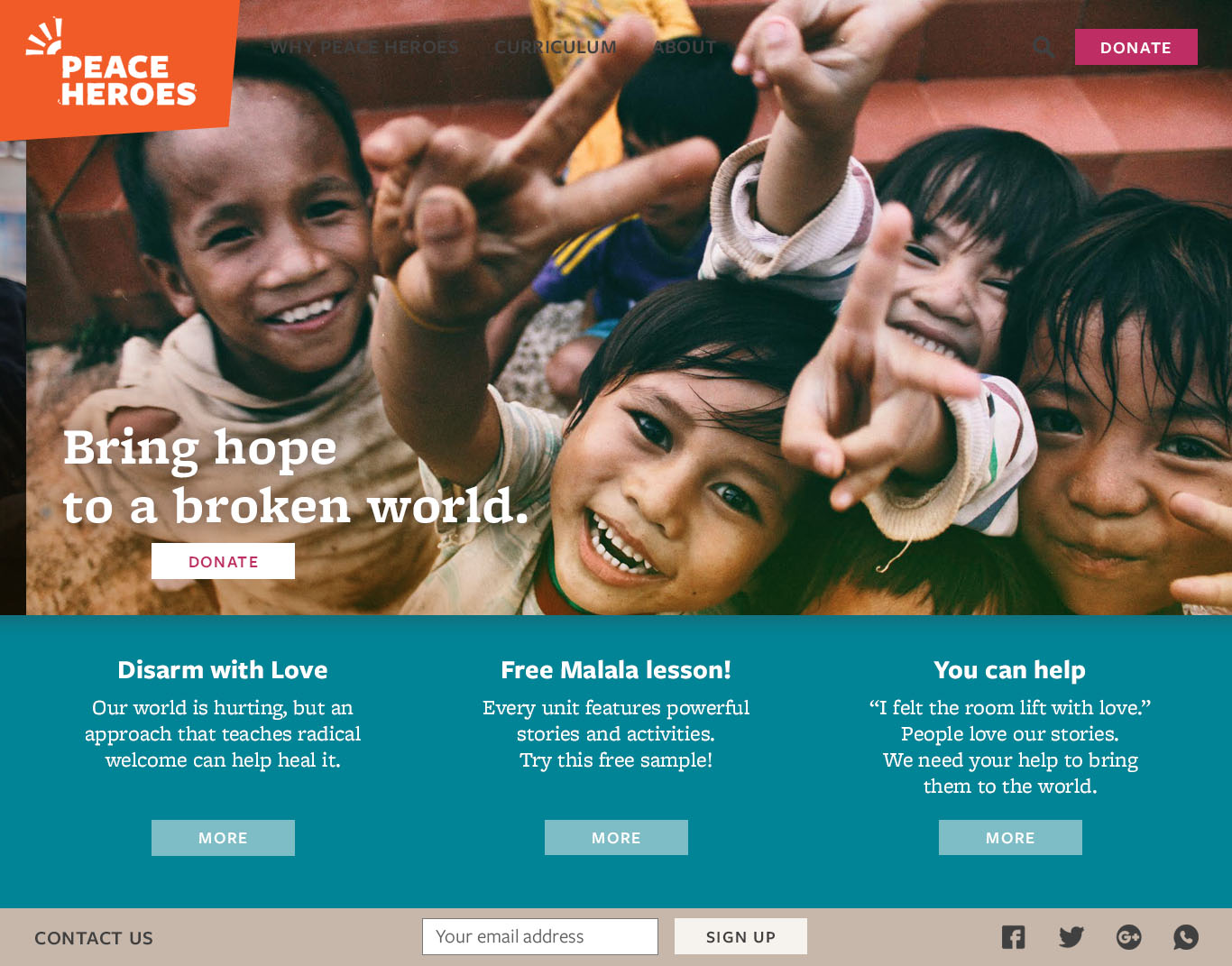
Clients liked the colorful boxes and the pop of color of the teal, but decided to go with a more neutral and warm color scheme. In order to accommodate more text across the hero image, I cropped off the two children on the left.
The final homepage design:
Landing pages
These pages show how a large a mount of text can be broken up with images and the use of repeating design elements. That repetition of design elements makes the site cohesive and cuts down on development costs. Photographs are treated with an orange and yellow overlay to give them a warm glow and and
The curriculum
There will be only one curriculum online in phase 1, so ideas on how to navigate and structure it will have to wait a little longer. Making the lessons truly interactive will be an exciting project!
I created these icons in Illustrator to break up the text in the curriculum and highlight activities:
Lesson as PDF:
Users (educators or potential donors) can download lessons as PDFs. I created a document that is in line with the branding and the visual design of the website.
User Testing
Happening right now!
Based on a script I wrote, I ask users about their impressions of the homepage and to perform the following tasks:
What is Peace Heroes? Find out what Peace Heroes does.
Download curriculum: Navigate to the curriculum and download the PDF.
Donate $1 (without actually paying, of course).
Sign up for the newsletter.
The results:
Coming soon!
next steps
Finish user testing
More Q&A
Some adjustments in visual design, e.g. font sizes
Start thinking about phase 2!


